
On Design: Searching for a More Visual News Site

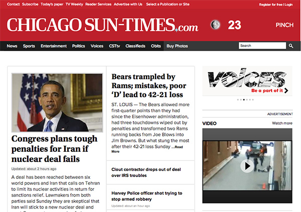
When the Chicago Sun-Times laid off its entire photo staff last year, I commented that one of the problems was the utter failure of website design to appropriately showcase photography. Here is an example of the current design and the way photography is displayed:
The only image that appears “above the fold” is a staggering 306 pixels wide.
Design is a much higher priority at The New York Times, and they have a few distinct layouts: 1) lede image, 2) lede image + slideshow, 3) sidebar image, 4) dedicated slideshow, 5) Lens blog. Here’s what they look like:


